Creating a nice looking visualization can be quite a challenge. Sometimes it seems that everything is fine but you still have the feeling that something is wrong.
If you are reading this article, then you are probably curious about what you can do to improve the appearance of your architectural visualizations. Below I would like to show you a few tips for improving interior visualizations.
The Right Scale
If you are working on a project where you have every dimension, then you probably will not have a problem with that. But it is not always possible. In a large number of cases, and especially in projects that are to present not so much interior, but some element of its equipment, you will not be able have all dimensions. It is important that all sizes are real. I mean mainly the room height, wall thickness, the size of windows and doors. So you need to check what height should have the room you are currently working on. Different will be for an attic, another appartament on the ground floor in a standard building, and another office room.
If you’re an architect, then you should not have a problem with that. But if you are a more 3d artist, it is worth to check their values somewhere in the internet. All kinds of forums and websites about construction are very helpful. Do not try to average the values that you will find. If you have, for example, stairs, whose height is 17cm, and 26cm wide, then do not round them to 15cm and 25cm. Although you could think everything seems to be okay, but it will eventually look that something is wrong.
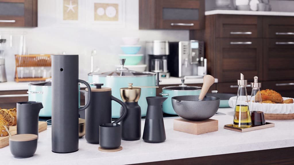
A good example here can be the work on the visualization of the kitchen.
You must remember about such things as the height of the countertop. Same for the distance from the countertop to the hanging shelves, the depth of the hanging shelves. Try not to think about it as a visualization, but as a real interior where you would prepare a meal. Sometimes you can help yourself by inserting an outline of real-life figures in the scene. Thanks to this, you will have a point of reference as to how it presents itself in proportion to a person.
In addition to the main elements of the interior, you also need to properly arrange its elements. For example, if you set the halogen lights on the ceiling, check what distance should be between them depending on how much light they emit.
Scene Composition
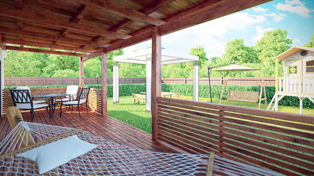
The right compositon of your scene can have a significant effect on how the image will be received by the person watching it. You can not just randomly place models into scene. Look at it in a different way. Try to decide what kind of interior you are doing and then imagine the person who uses it. You can not, for example, set a shelf in a place you can hardly get to, or put some decorative plant in a place where someone will constantly go into them.
Of course, it is also important that the interior you create has elements set in an even and straight way. But you can not overdo it. Chairs set at perfect equal angles and intervals exactly every 20 cm will not be a good idea. Try to add some chaos to your scene. Not too much, but create the impression that someone could use it.
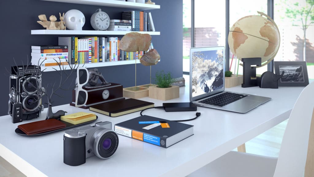
Props Usage
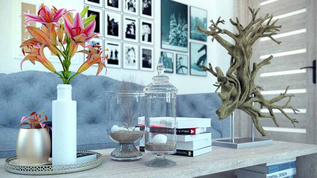
As I mentioned in the previous tip, you have to create the impression that your rendered image is the actual interior in which someone lives or use. Add appropriate props to the scene. In the case of a living room, for example, adding an open book and an unfinished meal will allow you to create this effect.
In addition, it is also worth adding props that will add a bit of style to your scene. It could be various wall decorations, types of lamps that match the style of your interios. Of course, you can not forget about vegetation. A few nice looking potted plants will allow you to give a little life to your scene. Many props and decorations that will help you in this case you can find here: Props and Decoration 3D Models
Detailed Textures and Materials
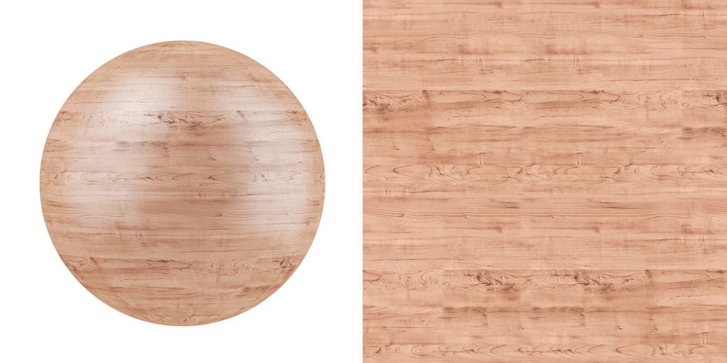
This is a more technical tip for improving interior visualizations. Try to use textures in the best quality. And I mean quality, not resolution. Many textures available can have resolutions up to 5000 pixels, but it does not matter if they are smudged or overlighted. It is worth remembering especially if we use them on large surfaces.
And since we are already with large surfaces, sometimes it is worth adding more interesting material to the walls. Many people put just plain white material on the walls. Sometimes it may be okay, but if you look at it, all walls are not perfectly flat and smooth. Every has delicate imperfections, stains, light differences in color. So it’s a good idea to use texture on them. Thanks to this, you will get much more realism which will allow you to improve interior visualization.
You can not forget about the floor. In the case of tiles, this tip may not be so significant, but it is also worth using. If you have to do wooden floor panels, in their material, in addition to the usual diffuse maps, it is worth adding bump, specular and glossines. Thanks to this, when the light from windows will be reflected on the floor, you will see that it was worth doing. Such floor panels will look much more natural. If you use textures in high quality and adequately prepared, they will be indistinguishable from regular photo.
Camera and Light Placing
The right camera and lights setting can actually huge impact on how your interior will ultimately look. This is probably one of the most important tips for improving interior visualizations. By setting the camera in the right place with the appropriate focal lenght, you can completely change the perception of your render. You can test it and try to render your scene using the focal lenght 24mm first, then zoom out the camera and use 90mm. I assure you that even though the two images will be very similar, their perception by the viewer will be different. Therefore, it is worth getting acquainted with the basics of photography, because the skills gained in this way will turn out to be irreplaceable when working on visualizations.
Setting the lights also significantly changes the appearance of the interior. Do not be afraid to add other lights, in addition to those coming from the windows. Of course, remember to keep their proper emmision value. You do not want the light from the lamp to be much brighter than the sun light. Try to play with their angles and intensity. You can also try the three point lighing principle, which is used both in the movies, still photography and computer graphics: https://en.wikipedia.org/wiki/Three-point_lighting
Render Quality
The final step in creating a visualization is its high quality rendering. As you progress, you should, of course, do low-quality test renders. The last render, however, must be made with the possible best quality. I do not mean the resolution as much as the quality. You cannot render 5k image, but have a lot of noise and GI stains on it.
Try to use a large amount of Global Illumination bounces. In the case of a complex scene with lots of furniture and props, you must be sure that the light will reach the deepest corners. Thanks to this you will avoid the creation of some ugly spots and make the lighting in the scene look the most realistic. Also use more light and material subdivs, which will allow you to avoid noise on the surfaces of objects.
It is also worth using different render elements, such as reflection, shadows or z-depth, as long as the software in which you work allows it.
Conclusion
I hope that the above article will be useful. Thanks to the use of the tips for improving interior visualizations mentioned here, your render images will become more natural and look better. If any of you have any tips you would like to share, I’d encourage you to comment underneath.


